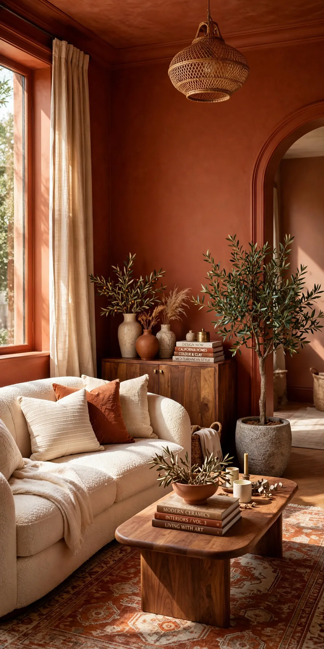
2026 Paint Color Trends: 35 Fearless Ideas to Try Now
Your walls might be ready for something bolder than another coat of white. The 2026 paint color trends bring smoky greens, earthy reds, rich browns, and playful blues into rooms that need a little personality. And you do not have to repaint the entire house to make an impact.
From a copper clay kitchen island to butter yellow doorframes and a sage checkerboard floor, these 35 ideas show where a striking shade can work and what to pair with it. The trick is choosing color for the light you actually have, not just the paint chip that caught your eye in the store.
Test generous swatches morning and evening, consider your flooring and furniture, and start with a project that suits your budget. You might discover that a single doorway is all the change you need.
1. Smoky Jade Walls
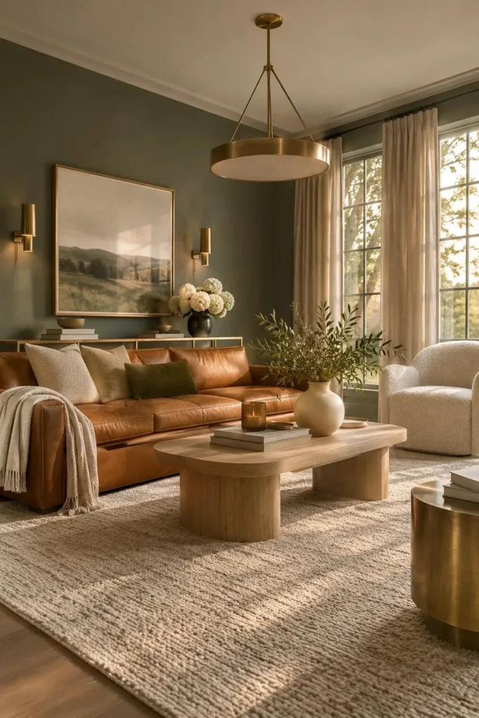
Smoky jade brings depth to a living room without making it feel heavy. Behr’s 2026 Color of the Year, Hidden Gem, blends blue and green for a shade that shifts with daylight. Paint the main walls, then balance their richness with an ivory rug and warm wood furniture.
Before buying a gallon, brush two sample squares beside the window and behind the sofa. Check them in morning light and under lamps at night. A soft white ceiling keeps the room open, while brass or caramel accents prevent the green from feeling too cool.
2. Espresso Brown Library
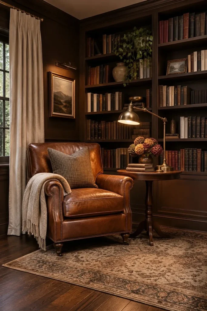
- A deep espresso wall can make an ordinary reading corner feel intentionally designed. Choose a brown with subtle charcoal undertones rather than a flat, reddish chocolate shade.
- Paint built-in bookshelves the same color as the wall to create a continuous backdrop. Keep a few shelves partially empty so books and decorative pieces remain visible.
- Introduce cognac leather, antique brass, and cream textiles to soften the dark palette. These finishes add warmth without competing with the wall color.
- Install a warm reading lamp beside your favorite chair. Focused lighting makes darker corners more functional while highlighting the richness of the paint.
Benjamin Moore’s 2026 shade Silhouette has espresso and charcoal undertones, making it especially interesting in rooms with layered lighting. Choose a matte finish for walls and a more washable finish for trim. In small rooms, leave some breathing space around books and artwork so the dark color feels deliberate.
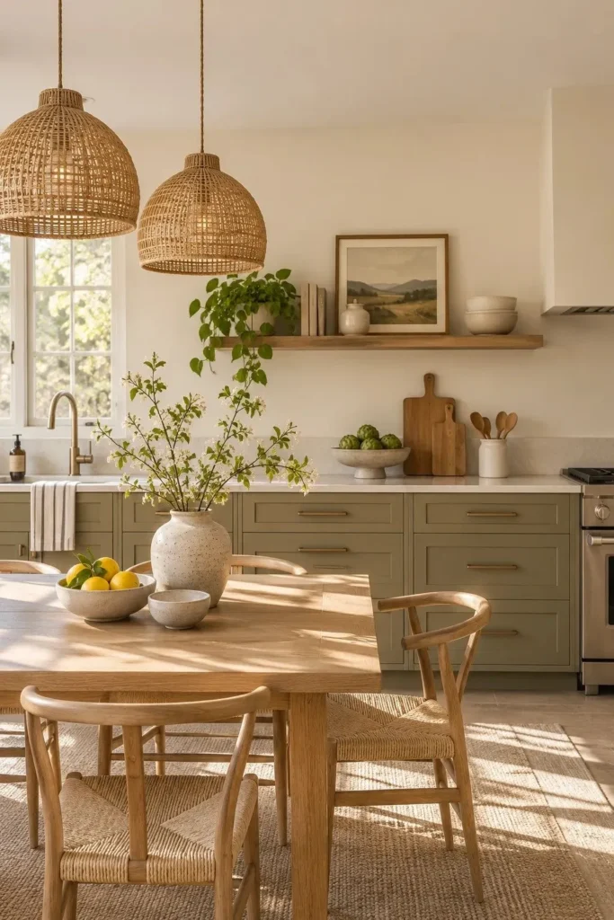
3. Warm Khaki Cabinetry
Quick Tip:
Don’t trust a tiny khaki paint chip under store lighting. Paint one removable sample board and hold it vertically beside your cabinets. Compare it against the countertop and floor during both morning and evening light.
Among the 2026 paint color trends, warm khaki offers a gentle alternative to white cabinetry. Sherwin-Williams named Universal Khaki its Color of the Year for 2026. Pair it with creamy walls and natural oak, then use a cabinet rated paint and proper primer for a durable, even finish.
4. Deep Aubergine Bedroom
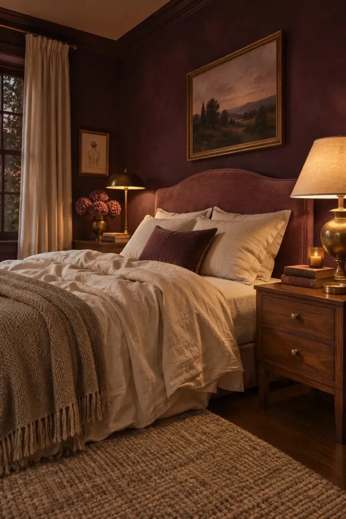
BEFORE:
A bedroom with plain gray walls can feel cold and unfinished, especially under artificial lighting. Light furniture blends into the background, leaving the room without a clear focal point.
AFTER:
Deep aubergine walls create a rich backdrop that makes ivory bedding and walnut furniture stand out. Brass lamps introduce a warm glow, while dusty rose accents soften the dramatic purple undertones.
Plum and aubergine are gaining attention among 2026 paint color trends because they offer a sophisticated alternative to conventional neutrals. For a balanced bedroom, paint the walls and keep the ceiling warm white. Test your chosen shade beside the headboard first, since dark purples can appear almost brown under warm bulbs.
5. Sunbaked Terracotta Ceiling
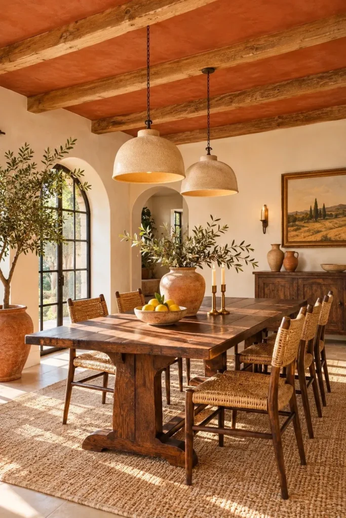
- Start overhead: Turn a plain ceiling into a striking feature with muted terracotta paint. Choose a clay shade with brown undertones rather than bright orange.
- Prepare the surface: Clean away dust, fill small cracks, and apply suitable primer where necessary. Protect your furniture and flooring with drop cloths.
- Apply even coats: Use a ceiling roller and work in overlapping sections. Allow the recommended drying time between coats.
- Balance the palette: Keep surrounding walls creamy white and introduce natural wood, woven seating, and understated ceramic accessories.
A terracotta ceiling brings warmth into a dining room without taking away valuable wall space. It works especially well with oak furniture and warm white walls. Before committing, test a large sample overhead, because ceiling shadows can deepen the color considerably. Use sufficient lighting to prevent the room from feeling dim.
6. Butter Yellow Doorframes
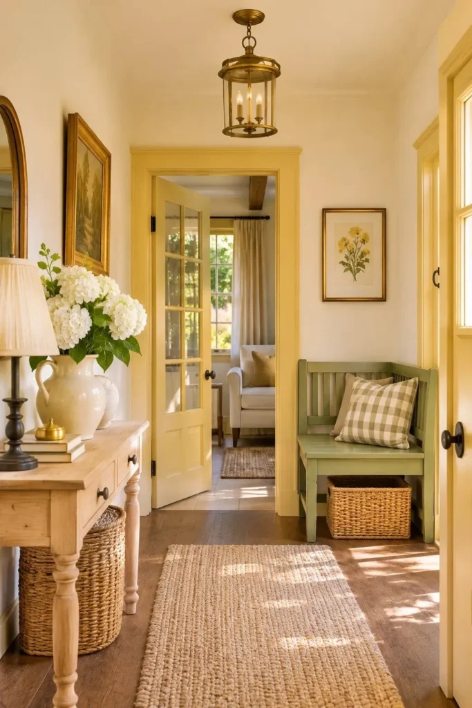
| Design Detail | Plain White Trim | Butter Yellow Trim |
|---|---|---|
| Visual effect | Blends into walls | Highlights architectural lines |
| Best wall pairing | White or light gray | Warm ivory or muted sage |
| Overall mood | Simple and understated | Cheerful and vintage inspired |
| Decorative accents | Neutral accessories | Oak, brass, and botanical prints |
Butter yellow gives ordinary doorframes a cheerful personality without requiring a full room repaint. Its growing popularity in 2026 reflects renewed interest in warmer, expressive interiors. Choose a soft, creamy shade and use a durable satin finish on frequently touched trim. Keep nearby decorations restrained so the painted doorway remains the main attraction.
7. Warm Mahogany Color Drench
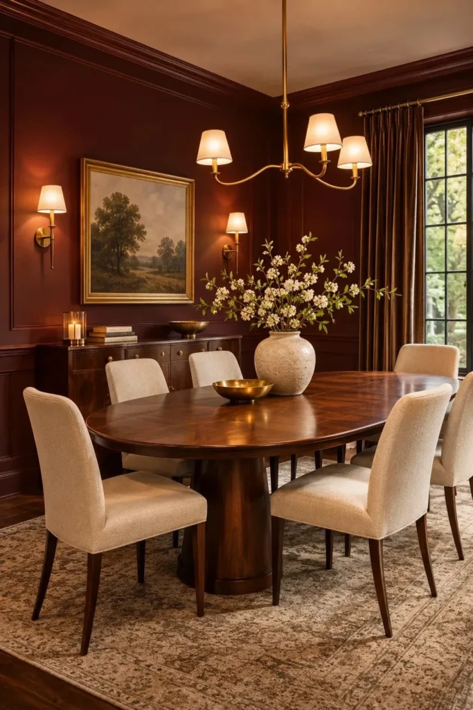
DO:
- Paint walls and trim in matching mahogany for a rich, continuous finish.
- Pair the deep red with cream upholstery and medium walnut furniture.
- Use warm brass lighting to highlight the color’s earthy undertones.
- Introduce a pale rug to balance the darker surfaces.
DON’T:
- Combine mahogany walls with several competing bright accent colors.
- Choose glossy wall paint without considering surface imperfections.
- Ignore how the shade changes under evening lighting.
- Overcrowd the room with heavy, dark furniture.
Warm mahogany is one of the standout choices in the 2026 paint color trends, with PPG selecting it as its Color of the Year. Its rich red undertones bring warmth to traditional and contemporary interiors. For the most balanced result, repeat the color selectively and keep larger furniture pieces understated.
8. Smoky Aqua Shelving
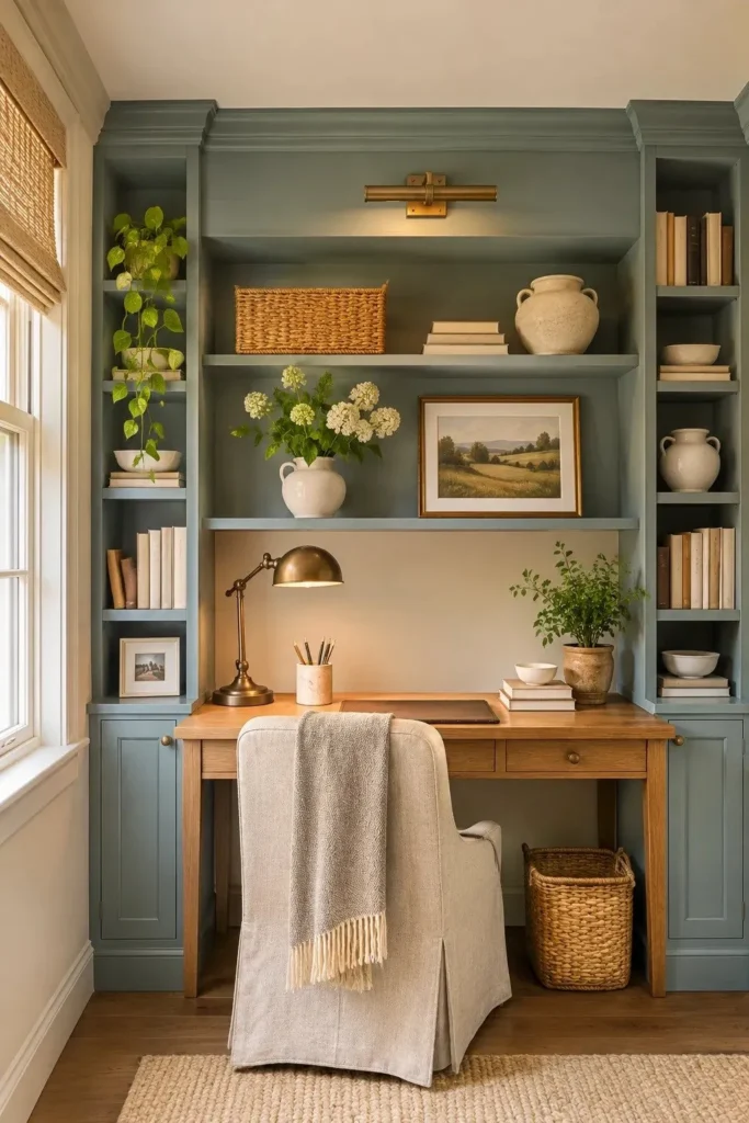
Best For: Home offices, reading corners, and recessed bookcases.
Cost: Low to moderate, depending on shelf size and paint preparation.
Time: A weekend project, allowing additional time for curing.
Finish: Durable satin or cabinet paint for frequently handled surfaces.
Smoky aqua gives ordinary shelving a subtle wash of color without overwhelming the room. PPG includes Aqua Smoke in its 2026 Heirloom palette, highlighting the appeal of softened blue tones. Paint the shelf interiors and frames together, then display cream ceramics and natural wood accessories to maintain a clean, balanced appearance.
9. Soft Lilac Guest Room
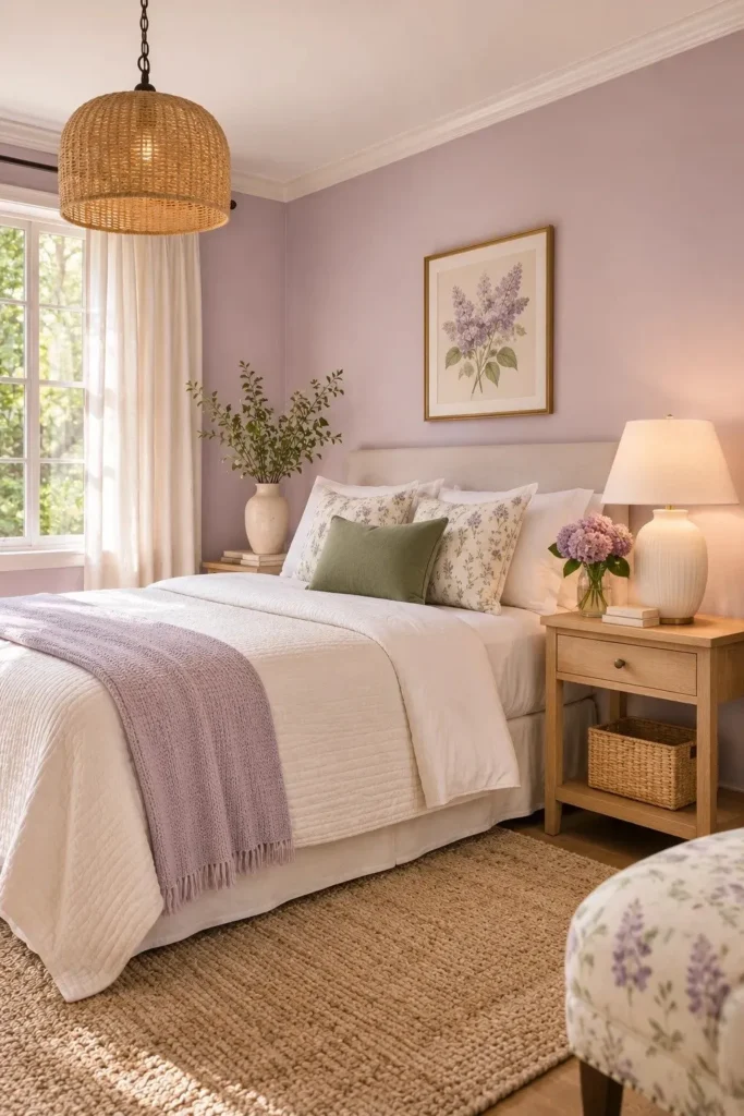
Soft lilac creates a welcoming bedroom without the sweetness of traditional pastel purple. Choose a muted shade with gray undertones, then pair it with ivory bedding and pale oak furniture. PPG includes Lovely Lilac in its 2026 Portal palette, making this delicate color a timely choice for refreshing guest spaces.
For a polished finish, paint all four walls and keep the ceiling a gentle warm white. Add one sage cushion, natural linen curtains, and simple botanical artwork. Test the lilac beside your bedding before painting, since cool daylight may reveal stronger blue undertones than expected.
10. Copper Clay Kitchen Island
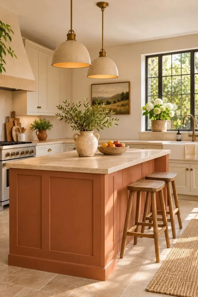
- A copper clay kitchen island instantly draws attention without making the entire kitchen feel overly colorful. Choose a muted shade with earthy brown undertones for a softer appearance.
- Keep surrounding cabinets creamy white or warm beige. This contrast allows the island to stand out while maintaining a bright cooking space.
- Install brushed bronze or antique brass cabinet pulls. Their warm metallic finish complements the clay color without creating unnecessary contrast.
- Pair the island with natural oak stools and a pale stone countertop. These materials help establish a grounded, Mediterranean inspired palette.
- Test the paint beside your existing flooring and backsplash. Orange undertones can become surprisingly strong under warm kitchen lighting.
Copper and pottery inspired colors bring a welcoming warmth to modern kitchens. Benjamin Moore includes Southwest Pottery in its 2026 color palette, reflecting interest in earthy finishes. Use durable cabinet paint and allow proper curing before heavy use. A single painted island can give an otherwise neutral kitchen a distinct personality.
11. Deep Teal Powder Room
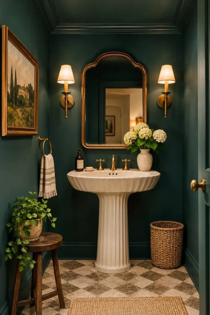
Quick Tip:
Paint the walls and ceiling the same deep teal to reduce visual interruptions in a compact powder room. Test the color under your actual bathroom lighting before committing. Choose moisture resistant bathroom paint and ensure adequate ventilation.
Deep teal makes a small powder room feel intentional rather than forgotten. Benjamin Moore’s 2026 palette includes Narragansett Green, a dramatic blue green suitable for this treatment. Pair dark walls with a white sink, antique brass mirror, and warm sconces. Keep accessories minimal so the saturated color remains the main feature.
12. Dusty Rose Living Room
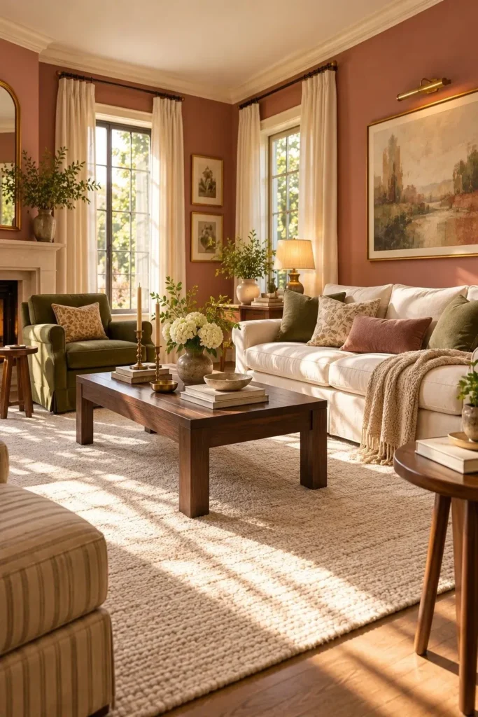
BEFORE:
A living room with cool gray walls can appear flat, particularly when paired with pale upholstery and minimal decoration. The furniture feels disconnected, and the room lacks the warmth needed for relaxed evenings.
AFTER:
Dusty rose walls create a softer backdrop that complements cream furniture and dark walnut accents. An olive green armchair adds gentle contrast, while brass lighting introduces warmth without making the palette feel overly feminine.
Dusty rose offers an approachable way to introduce color into a neutral living room. Benjamin Moore’s 2026 selection includes First Crush, a gentle blush tone that pairs naturally with warm whites. For a mature finish, choose muted pink undertones and limit patterned accessories. Natural wood helps keep the overall appearance grounded.
13. Olive Green Wainscoting
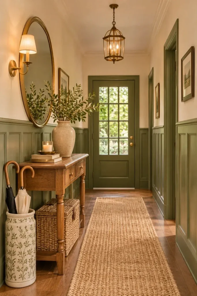
- Choose your height: A plain hallway gains instant character with olive green wainscoting. Mark a consistent line approximately one third of the way up each wall.
- Prepare the panels: Clean the woodwork, fill visible gaps, and lightly sand glossy surfaces. Apply a suitable primer before painting.
- Choose a muted green: Select an olive shade with earthy gray undertones. Apply two even coats, allowing adequate drying time.
- Finish the upper walls: Paint the remaining wall surface warm ivory. Complete the look with an oak console, brass mirror, and natural woven runner.
Olive wainscoting brings depth to a hallway while leaving the upper walls light and open. Muted, nature inspired greens appear across several 2026 forecasts, including Valspar’s Warm Eucalyptus. For older trim, sand glossy paint before priming, and use a durable finish where coats and bags brush against the panels.
14. Indigo Blue Alcove
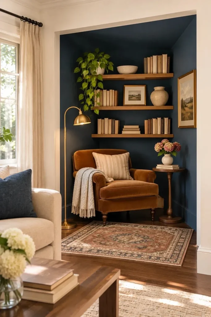
| Design Detail | Plain Neutral Alcove | Indigo Blue Alcove |
|---|---|---|
| Wall appearance | Blends into surrounding walls | Creates a defined focal point |
| Furniture pairing | Light wood and neutral upholstery | Caramel velvet and warm oak |
| Lighting effect | Bright and understated | Rich and atmospheric |
| Decorative accents | Cream pottery and pale artwork | Brass details and patterned textiles |
An indigo alcove introduces bold color without painting an entire room. Dulux selected a family of blues for 2026, including deeper, meditative shades. Choose a paint sample that looks blue rather than purple under evening lamps, then repeat that tone in one cushion or ceramic vase for a connected scheme.
15. Golden Ochre Breakfast Nook
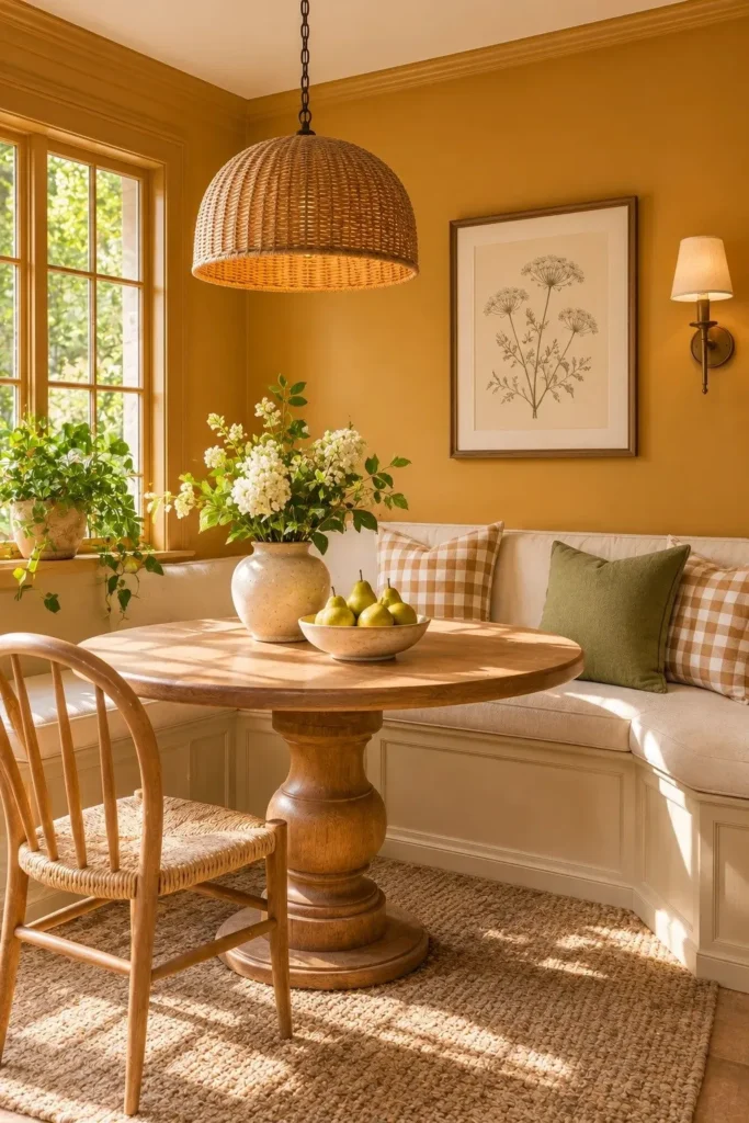
DO:
- Wake up a dull breakfast nook with a mellow golden ochre wall color.
- Pair the warm paint with cream upholstery and natural oak furniture.
- Choose a washable matte or eggshell finish for easier cleaning.
- Introduce subtle gingham cushions and handmade ceramic accessories.
DON’T:
- Choose a bright mustard shade without testing it in daylight.
- Combine ochre walls with too many competing orange accents.
- Paint the ceiling dark if the nook already receives limited sunlight.
- Overcrowd a small dining corner with oversized decorative pieces.
Golden ochre feels sunny without the sharp brightness of lemon yellow. C2 Paint’s 2026 Color of the Year, Epernay, is a soft ochre inspired by earthy warmth. Pair it with cream upholstery and medium oak, and keep the ceiling light so the breakfast nook stays cheerful even on cloudy mornings.
16. Misty Blue Ceiling
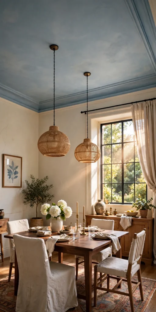
Visual Effect: A misty blue ceiling draws attention upward while keeping the walls bright.
Best For: Bedrooms, sunrooms, and compact sitting areas.
Cost: Low to moderate, depending on ceiling preparation.
Finish: Flat ceiling paint for a soft, low sheen appearance.
A misty blue ceiling adds color in an unexpected place while leaving the walls bright and flexible. Dulux’s 2026 Mellow Flow blue offers inspiration for this softer approach. Keep the trim warm white and repeat the ceiling color in one small accessory, such as a cushion, rather than matching every detail.
17. Mushroom Taupe Walls
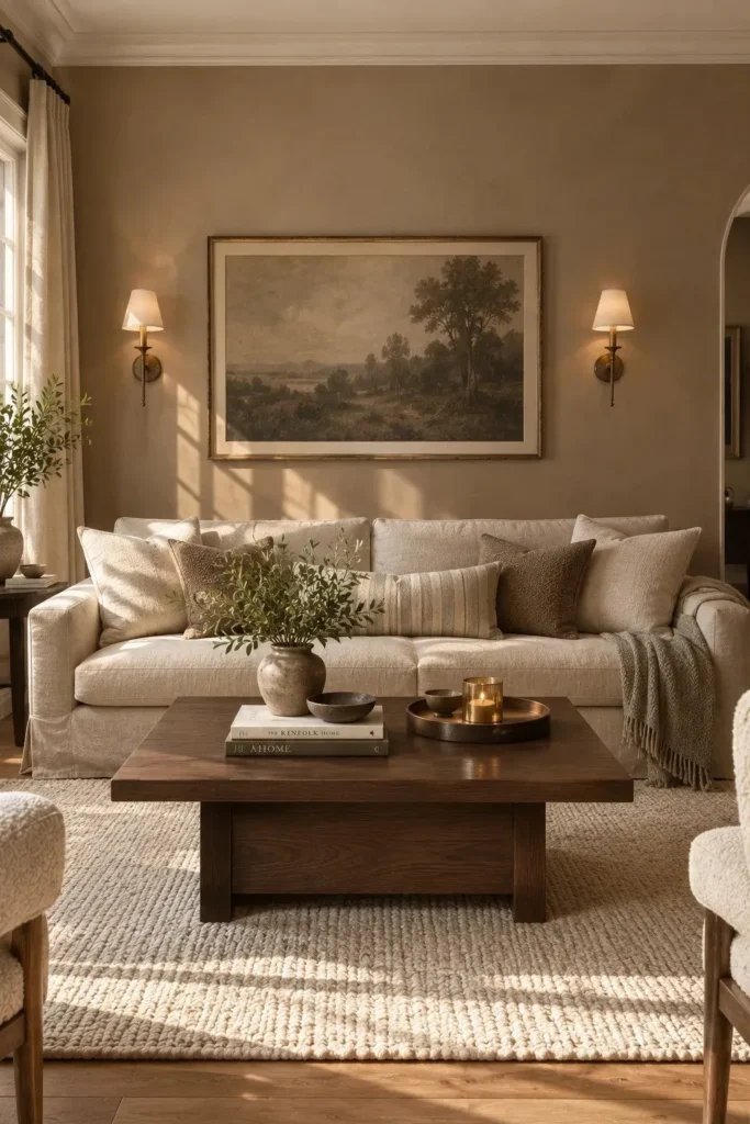
Flat gray walls can make a north facing living room feel colder than expected. Mushroom taupe brings in earthy brown undertones that soften the effect without turning the room beige. Choose a shade that sits comfortably between gray and brown, then pair it with cream upholstery and dark oak.
Sample the paint on two walls before committing, especially one beside the window and another in shadow. In cooler daylight, some taupes lean purple or pink. A warm white ceiling and aged bronze lighting can balance those undertones, while a charcoal framed print adds definition without another bold color.
18. Chartreuse Laundry Cabinets
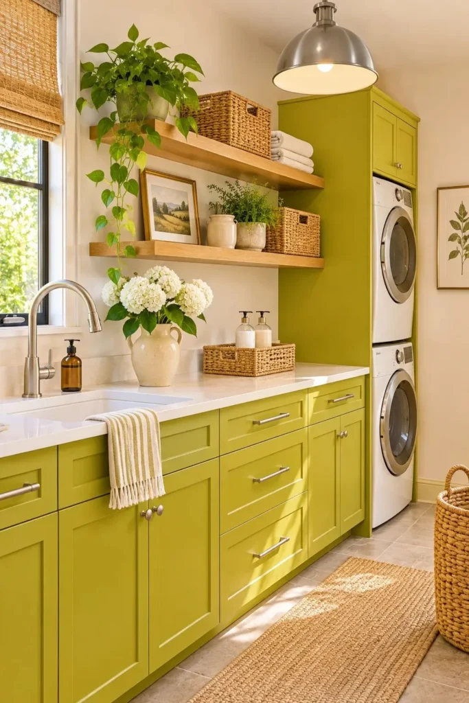
- A punch of chartreuse can turn a purely functional laundry room into a memorable corner. Keep the color on lower cabinets rather than every surface.
- Choose a slightly muted yellow green instead of neon lime. Sample it beside the flooring to check whether it looks grassy or fluorescent.
- Balance the cabinets with ivory walls, pale oak shelves, and white counters. These quieter finishes keep the room from feeling busy.
- Remove hardware, clean cabinet fronts, sand as needed, and prime before applying a durable cabinet paint. Follow the manufacturer’s curing instructions.
Chartreuse feels bold, but a small bank of cabinets makes it manageable. PPG’s 2026 palettes include playful greens, reinforcing the move toward expressive accent colors. Keep baskets and countertop accessories neutral, and replace only a few handles if the existing hardware clashes. The result stays lively without requiring a complete remodel.
19. Periwinkle Office Walls
Quick Tip:
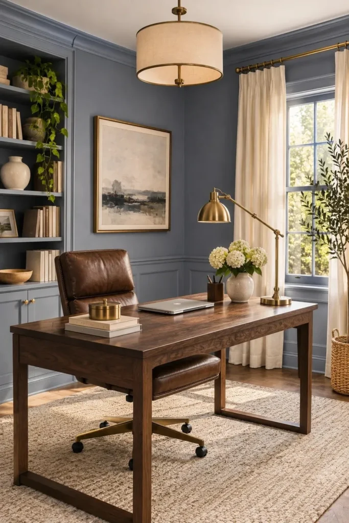
Periwinkle can appear surprisingly purple under warm artificial lighting. Test two large paint samples behind your desk and observe them throughout the day. Choose a slightly muted shade if your office already contains colorful furniture or artwork.
Periwinkle brings personality to a workspace without the heaviness of navy. Pair blue violet walls with chocolate brown furniture for a sophisticated contrast. Designers have highlighted this unexpected color combination for 2026. Keep the ceiling warm white and introduce cream textiles to balance the room’s cooler undertones.
20. Deep Emerald Fireplace Wall
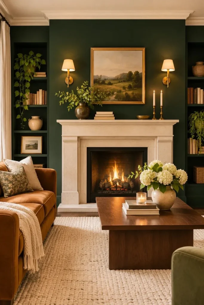
BEFORE:
A plain white chimney breast can disappear against surrounding neutral walls, leaving the fireplace without much visual presence. Even an attractive mantel may look unfinished when the wall behind it lacks contrast.
AFTER:
Deep emerald paint creates a striking architectural focal point while highlighting the lighter stone surround. Warm brass sconces and walnut furniture balance the jewel toned color, giving the living room a refined, layered appearance.
Deep Emerald appears in PPG’s 2026 Collective color palette, making it a strong reference for this dramatic treatment. Paint the chimney breast rather than the entire room to control visual intensity. Keep paint away from heat exposed surfaces unless the product is specifically rated for that application.
21. Ruby Red Pantry
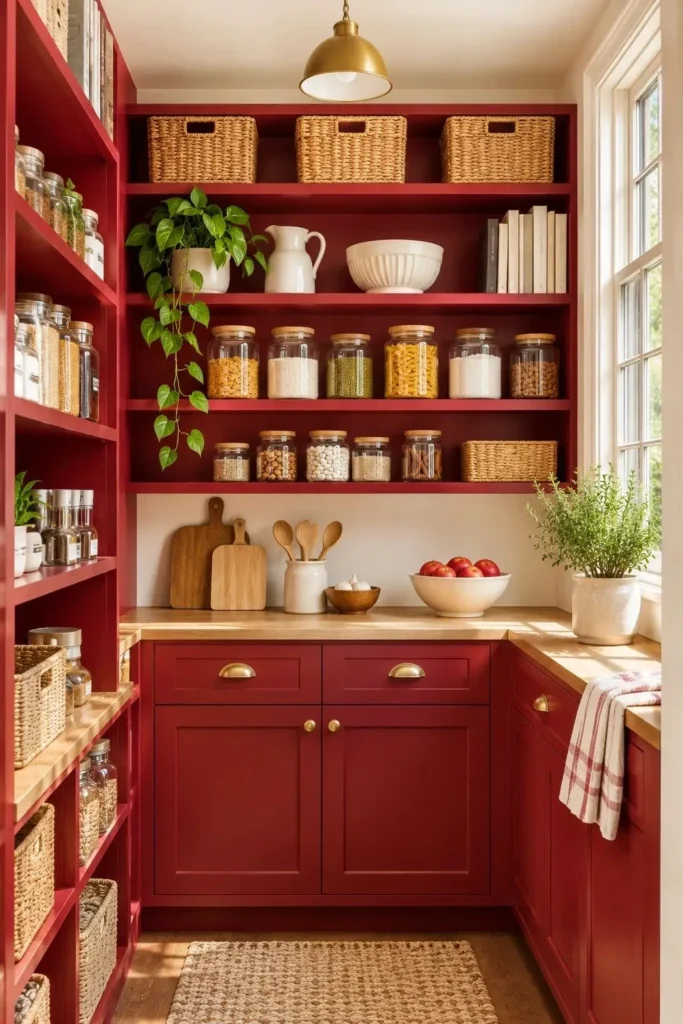
- Choose a vibrant red: Give a forgotten pantry a bold personality with ruby red cabinetry. Select a rich shade with subtle berry undertones rather than a harsh primary red.
- Prepare the shelves: Remove stored items, clean greasy surfaces, and sand glossy finishes. Apply a compatible primer before introducing the new color.
- Paint strategically: Cover cabinet interiors, shelving supports, and visible trim with a durable finish. Allow each coat to dry according to the manufacturer’s instructions.
- Style with contrast: Return clear glass containers, woven baskets, and neutral accessories. Leave surrounding walls creamy white to prevent the compact pantry from feeling overwhelming.
Ruby red adds a playful surprise behind an otherwise ordinary pantry door. PPG’s 2026 Collective palette includes Ruby Lips, reflecting interest in expressive red accents. Keep shelves organized and avoid painting surfaces that directly contact unpackaged food. The saturated backdrop makes even simple glass jars look intentionally arranged.
22. Clay Red Stair Risers
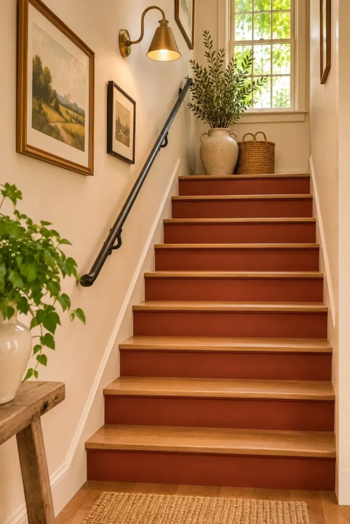
Quick Tip:
Paint the risers rather than the treads for a dramatic color change without altering the walking surface. Choose a durable, scuff resistant coating suitable for painted woodwork. Use painter’s tape along every tread edge to achieve clean, professional looking lines.
Clay red brings unexpected warmth to an otherwise forgotten staircase. PPG’s 2026 Ode palette includes Red Clay, offering inspiration for this earthy treatment. Keep the treads natural wood and surrounding walls creamy white. Test one riser first to check how the color looks in your hallway lighting.
23. Smoky Slate Bathroom Vanity
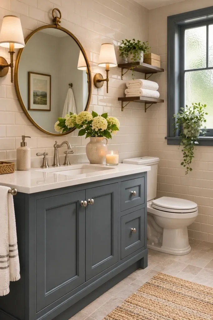
BEFORE:
A standard white vanity can disappear against matching tiles and pale countertops. Although the bathroom feels clean, the cabinetry lacks definition, leaving the room visually unfinished.
AFTER:
Smoky slate cabinetry introduces subtle contrast without the heaviness of black. A white countertop, brushed metal hardware, and warm lighting bring balance, giving the bathroom a more polished appearance.
Smoky Slate appears in PPG’s 2026 Heirloom palette, making it a grounded reference for bathroom cabinetry. Choose moisture resistant cabinet paint, prepare the surfaces carefully, and allow sufficient curing time. In bathrooms with limited daylight, test the shade beside existing tiles to identify unwanted purple or green undertones.
24. Cobalt Blue Doorway
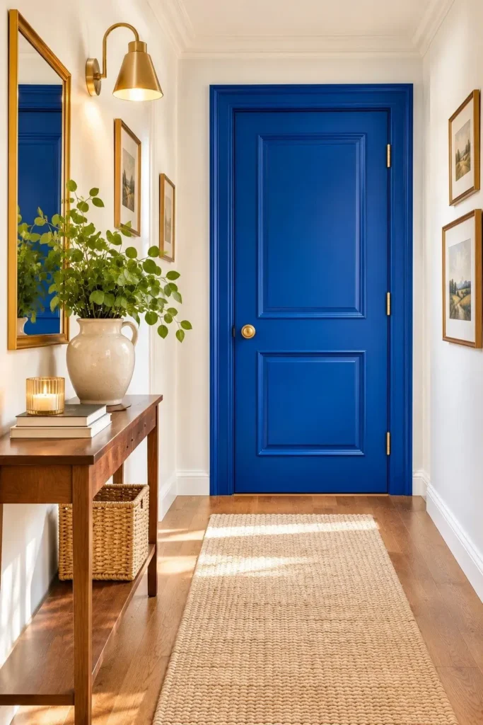
- Choose a striking blue: Turn an ordinary hallway door into a bold architectural feature with saturated cobalt blue. Select a shade that looks vibrant without appearing overly purple.
- Prepare the surface: Remove or protect the hardware, wash the door, and lightly sand glossy surfaces. Apply a compatible primer where necessary.
- Apply the paint: Use a small roller for flat areas and a brush for recessed panels. Apply thin, even coats and follow the manufacturer’s drying instructions.
- Balance the surroundings: Keep neighboring walls warm white and introduce natural oak furniture. Repeat a small amount of blue in nearby artwork for visual consistency.
Dulux selected the vibrant indigo Free Groove as part of its 2026 blue color family, offering inspiration for this doorway treatment. A satin or semi gloss trim finish handles frequent touching better than flat wall paint. Start with one interior door before committing to additional architectural details.
25. Pistachio Green Window Trim
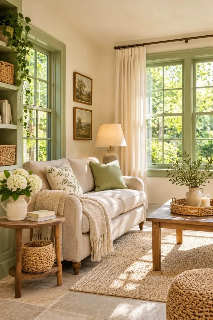
| Design Detail | Traditional White Trim | Pistachio Green Trim |
|---|---|---|
| Visual appearance | Blends into pale walls | Defines windows with soft color |
| Overall atmosphere | Simple and neutral | Fresh and nature inspired |
| Best wall pairing | White or light gray | Warm ivory or creamy beige |
| Decorative accents | Neutral accessories | Oak furniture and botanical prints |
Pistachio green introduces a refreshing color accent without overwhelming a neutral room. Soft greens complement the nature inspired direction highlighted in 2026 paint forecasts. Choose a muted shade with yellow undertones, then paint window frames in a durable satin finish. Keep nearby curtains ivory to highlight the delicate contrast.
26. Midnight Blue Dining Room
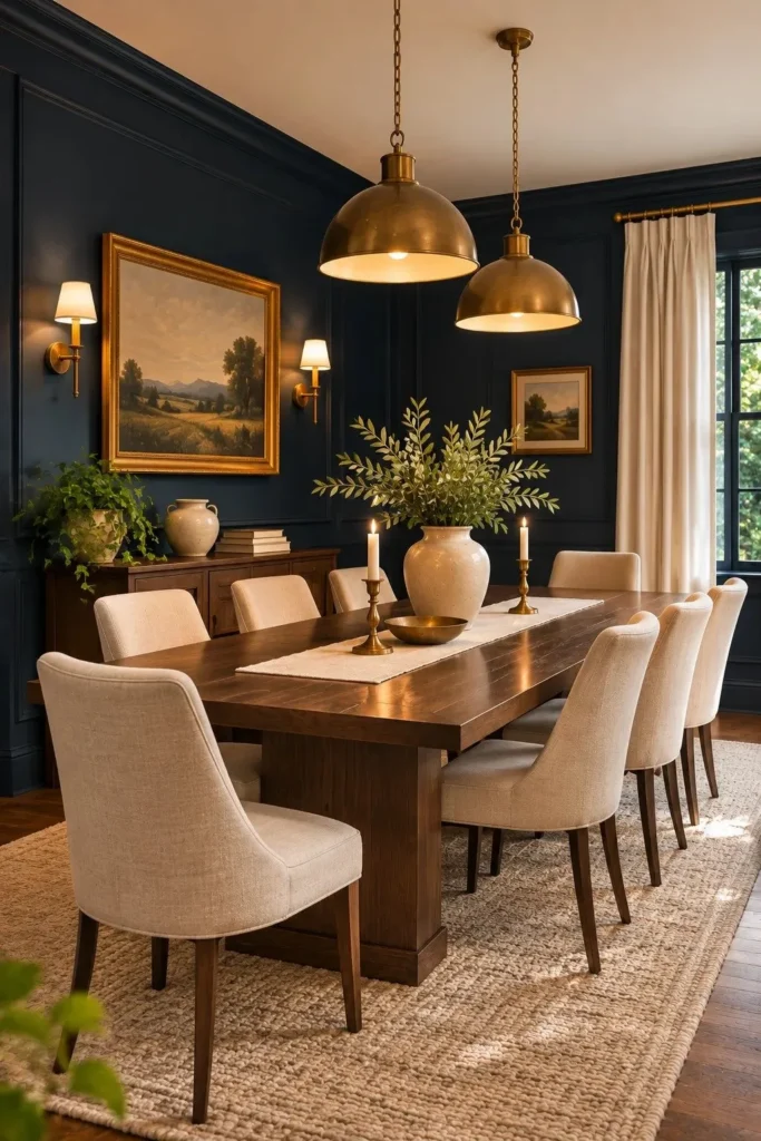
DO:
- Create a dramatic dining space with midnight blue walls and warm lighting.
- Choose a deep blue with subtle charcoal undertones for a sophisticated finish.
- Pair the walls with cream dining chairs and natural walnut furniture.
- Use brass pendant lights to bring warmth to the darker palette.
DON’T:
- Combine midnight blue walls with excessively dark flooring and furniture.
- Rely entirely on cool white bulbs for evening illumination.
- Choose glossy paint that emphasizes uneven wall surfaces.
- Overload the room with competing jewel toned accessories.
Midnight blue gives a dining room an intimate atmosphere without relying on black. Deep, saturated colors feature in PPG’s 2026 palettes, including its rich blue shade Cavalry. Keep the ceiling warm white and introduce layered lighting. Test the color after sunset, when darker blues can appear nearly black.
27. Spiced Cider Mudroom
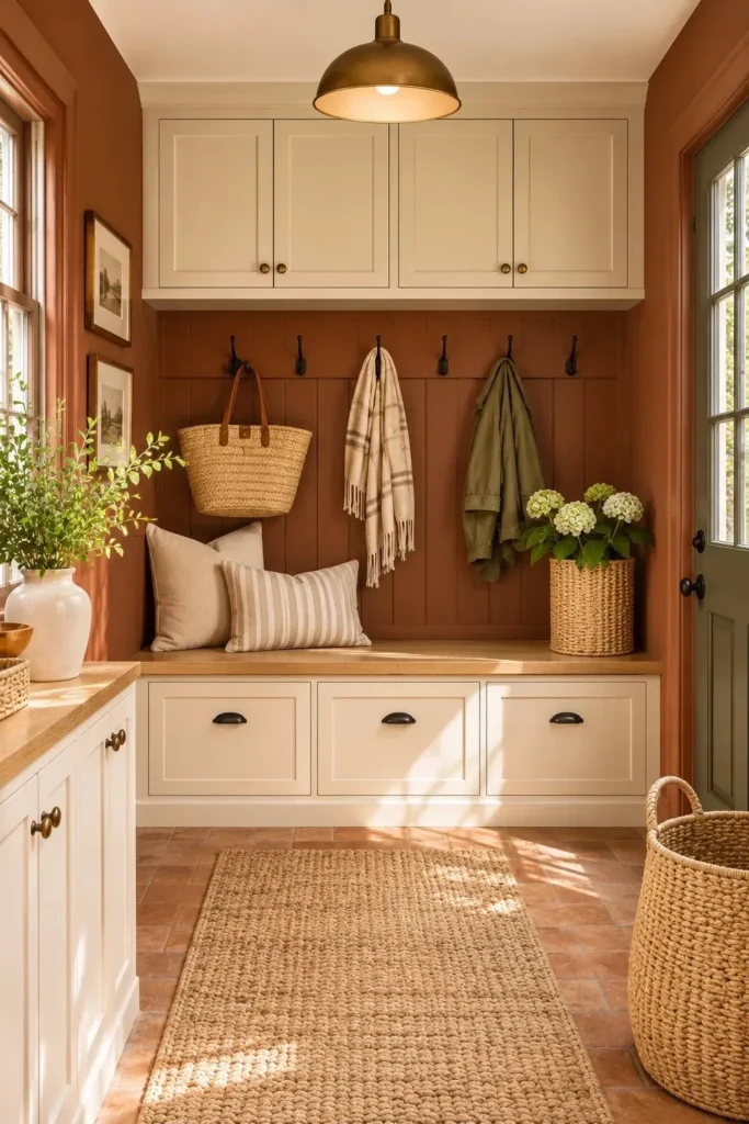
Best For: Mudrooms, entryways, and utility spaces with natural wood accents.
Cost: Low to moderate for a single room repaint.
Time: One weekend, excluding extended paint curing.
Finish: Washable eggshell or satin paint for frequently touched walls.
Spiced cider brown gives a busy mudroom a welcoming, earthy character while complementing practical storage. PPG includes Spiced Cider in its 2026 Heirloom palette. Pair it with cream cabinets, black hooks, and terracotta tiles. Choose washable paint near benches and coat storage, where muddy bags and jackets frequently touch the walls.
28. Buttercream Wall Paneling
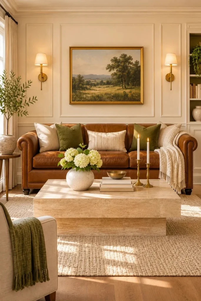
Best For: Living rooms, hallways, and bedrooms with decorative wall molding.
Cost: Low to moderate if paneling already exists.
Time: One weekend for preparation, painting, and drying.
Finish: Washable eggshell walls with satin painted trim.
Buttercream brings a softer alternative to stark white while highlighting architectural details. Warm, creamy whites feature prominently in 2026 interior color forecasts. Paint the wall and molding in the same shade, then introduce a subtle sheen difference for definition. Pair with cognac leather and natural oak for warmth.
29. Tobacco Brown Bedroom
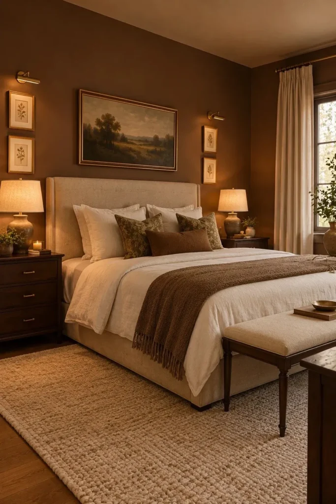
Few colors make a bedroom feel as grounded as tobacco brown. Its earthy undertones create a warm backdrop for oatmeal bedding, walnut furniture, and understated brass lighting. Designers are increasingly embracing richer browns instead of cool gray neutrals. Choose a muted shade with subtle olive undertones to prevent the room from appearing too red.
For smaller bedrooms, paint the wall behind the bed and keep the remaining walls soft ivory. Larger rooms can handle tobacco brown across all four walls, especially with generous daylight. Introduce cream curtains and a pale rug to maintain balance. Always test the shade under your evening bedside lamps.
30. Sea Glass Sunroom
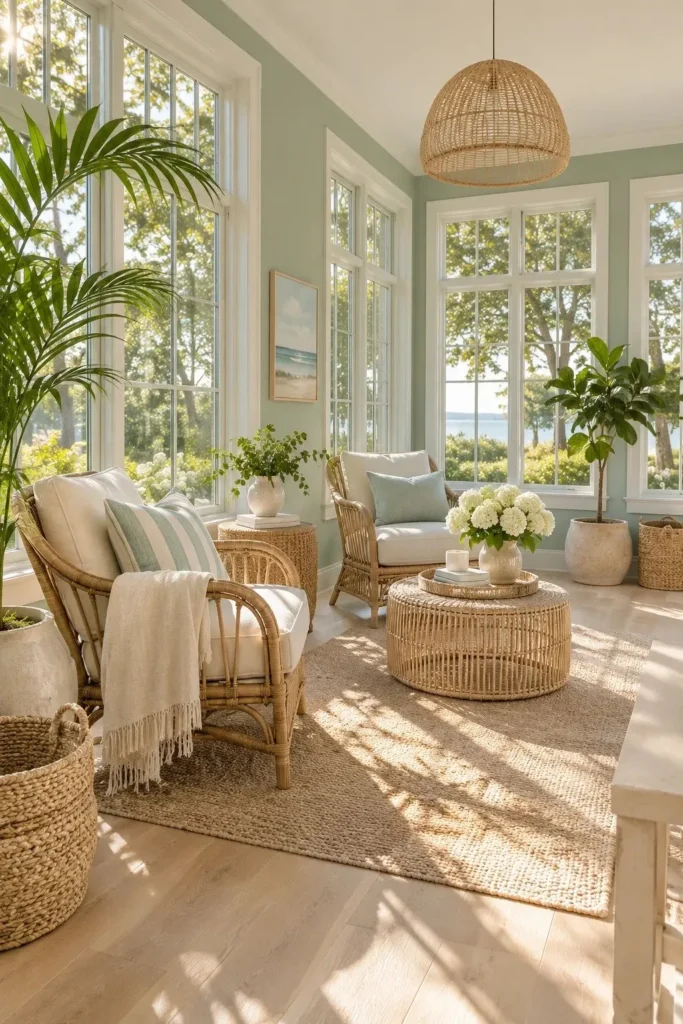
- Soft sea glass green brings a refreshing coastal feeling to a sunroom without relying on bright turquoise. Choose a muted blue green with subtle gray undertones for a gentle finish.
- Keep window frames crisp white or warm ivory to emphasize the natural daylight. This contrast allows the delicate green walls to remain noticeable without dominating the room.
- Introduce rattan chairs, linen cushions, and light oak furniture. These natural materials complement the cool wall color while maintaining a welcoming atmosphere.
- Place leafy houseplants near the windows to connect the interior with the outdoor landscape. Choose plants suited to the room’s actual light exposure.
- Test your paint shade on walls facing different directions. Strong afternoon sunlight can make pale blue greens appear much lighter than expected.
Misty blue greens are among the softer directions appearing in 2026 paint forecasts. Sea glass walls work especially well in rooms with generous windows and natural textures. Avoid pairing them with overly bright blue accessories. Instead, use cream textiles and woven furniture to maintain a relaxed atmosphere.
31. Apricot Painted Arch
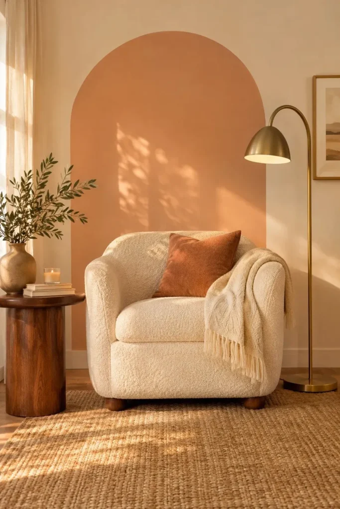
Quick Tip:
Create a clean painted arch using a pencil, string, and painter’s tape to outline the design. Choose a dusty apricot shade with soft beige undertones rather than bright orange. Apply two thin coats and remove the tape carefully before the final coat fully hardens.
An apricot arch gives a plain wall architectural interest without installing molding or wallpaper. Behr’s 2026 palette includes Iced Copper, a warm shade that offers inspiration for this treatment. Place a reading chair beneath the arch and keep surrounding walls creamy white. The contrast creates a cheerful focal point without overwhelming the room.
32. Burgundy Kitchen Cabinets
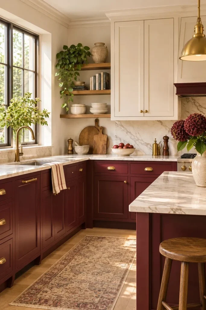
BEFORE:
An all white kitchen can feel overly plain, especially when the cabinetry, backsplash, and countertops share similar tones. Without contrasting finishes, even attractive architectural details may disappear into the background.
AFTER:
Deep burgundy lower cabinets introduce warmth and visual depth while preserving the brightness of ivory upper cabinets. Brass hardware and creamy stone countertops complement the rich color, creating a sophisticated kitchen with a distinctive personality.
Burgundy cabinetry offers a dramatic alternative to traditional navy and forest green. The 2026 color forecasts emphasize richer, nature inspired tones, including warm reds and browns. Paint only the lower cabinets to maintain balance, and use a durable cabinet finish. Test samples against your countertop before choosing the final shade.
33. Faded Denim Hallway
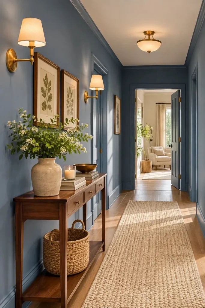
- Choose a muted blue: Give a forgotten hallway character with faded denim paint. Look for a dusty medium blue with subtle gray undertones rather than a bright coastal shade.
- Prepare the walls: Fill small holes, sand rough patches, and clean the surfaces. Apply primer where necessary to create an even base.
- Paint the trim: Carry the denim shade onto baseboards and doorframes for a continuous appearance. Use a compatible satin finish on the woodwork for easier cleaning.
- Add warm accessories: Introduce an oak console, brass lighting, and an ivory runner. Keep the ceiling warm white to balance the cooler wall color.
Faded denim brings a relaxed, lived in character to transitional spaces. Dulux’s 2026 blue color family highlights the versatility of both airy and deeper blues. For narrow hallways, choose a medium value shade rather than an extremely dark navy. Warm lighting helps preserve the color’s softness after sunset.
34. Soft Coral Bookcase
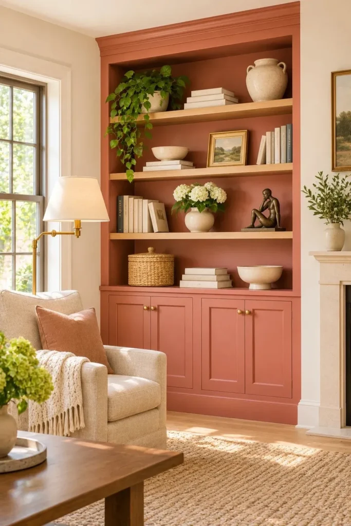
| Design Detail | Plain White Bookcase | Soft Coral Bookcase |
|---|---|---|
| Visual appearance | Blends into neutral walls | Creates a warm focal point |
| Color pairing | White and gray accents | Cream, walnut, and muted olive |
| Decorative styling | Neutral books and ceramics | Cream pottery and brass accents |
| Overall atmosphere | Simple and understated | Playful and inviting |
A softly colored bookcase gives display shelves a stronger outline while keeping the living room warm. Choose coral with dusty pink and clay undertones rather than bright salmon. Paint the frame and shelf backs together, then space objects generously. Test your sample beside wood flooring so the finish feels cohesive.
35. Sage Checkerboard Floor
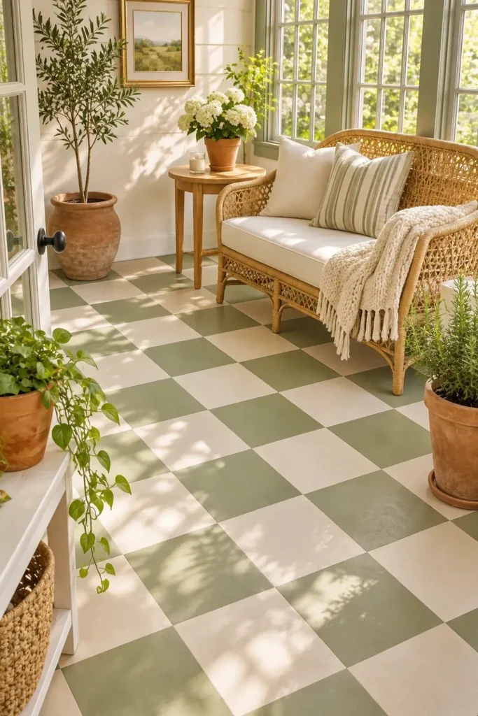
DO:
- Create a playful checkerboard pattern using muted sage green and warm ivory.
- Measure and mark equal sized squares before applying painter’s tape.
- Choose floor rated paint suitable for the existing surface.
- Allow the painted floor to cure fully before replacing furniture.
DON’T:
- Apply ordinary wall paint to frequently walked flooring.
- Paint over loose finishes, dirt, or moisture.
- Choose a slippery glossy finish for a high traffic area.
- Move heavy furniture across freshly painted squares.
Sage checkerboard flooring introduces pattern without relying on expensive replacement tiles. The combination feels fresh yet familiar, especially alongside woven furniture and warm white walls. For a practical finish, follow the paint manufacturer’s surface preparation instructions and consider slip resistance. Small sunrooms and laundry spaces are excellent places to experiment.
Conclusion
Bold paint choices do not have to mean painting every wall. A smoky jade living room, ruby red pantry, or buttercream paneled hallway can each make a room feel more considered, especially when the shade works with existing light and furnishings.
Use these 2026 paint color trends as a starting point, then sample your favorites before committing. Save this post on Pinterest so the ideas are easy to revisit, choose one small project to try this week, and share the article with a friend planning a refresh.
The most satisfying change is often the one you can actually finish. For more color inspiration, explore our sage green bedroom ideas and our dark blue bedroom guide.
One Comment